After about 20 minutes, apparently after all bandwidth in the office had been devoted to downloading the image (seriously, I checked fast.com on my desktop machine, and it said I had about 17 kbps down while the Miix was chugging away at 15 Mbps), it began to install the package. Beginning to end, it took about an hour and a half, and to be honest, the process was completely underwhelming. Gone were the multiple orange screens with radial graphs showing X% remaining, complete with multiple reboots (Update (10/18/17): my desktop machine experienced multiple reboots.). Gone were the inadvertently nerve-wracking reassurances that my files were left right where I left them.
Instead, after one reboot, and one brief note that things were updating, I was looking at my log-in screen. Which appeared slightly brighter, slightly crisper, but overall, pretty much how it’s always looked.
Not Much of an Update
Commentators have mentioned that the FCU is not much of an update. All we’re really getting with this update are some internal efficiencies, the new Acrylic design language (which brings a bit of Aero back to the UX), and the “Your People” thing down in the taskbar, which was supposed to come out in the (Spring) Creators Update. (More on that in a bit.) Oh, and the Photos App gets the ability to make rudimentary videos and stuff. Edge gets some updates, too, I guess. So there are updates, okay? They’re just not very ground-shaking.
(Speaking of Edge, I’m kinda really excited that Edge is coming to iOS, and I’m on the TestFlight program. Why am I excited? My wife sends me recipes, and it will be great to open those recipes in Edge on my phone, bookmark the recipe on the phone, and have the bookmark show up on the Miix so I can read the recipes more easily. In any event, Edge on iOS works fine.)
Your People
So. The “Your People” feature. This is a little icon in the tray that lets you add up to three people that you can pin to your taskbar for easy access for communication.

When you add a contact, it shows up in your taskbar, much as an app or a webpage would show up.

If I click on that icon, I get info, in this case, on how to contact Tomball ISD using the phone. If it were a person with a Skype address, or an email address, I’d be able to quickly send something to that person.
In theory, I suppose that makes a lot of sense. But the people with whom I communicate the most frequently are either right around the corner at the office, or through the Messages app on my iPhone. So this feature isn’t that compelling to me. (Now, if Apple would have made Messages an open standard like they said they were going to do, this would be a much more compelling feature.)
Photo Remix
Another new feature is that the Photos App has gotten a substantial overhaul. Now, when you open the App, you get to see all the photos you have uploaded in the background if you have the OneDrive App on your phone, and in that regard it works better than Google Photos. Google Photos is amazing in the way that it pieces things together, makes animations out of your bursts or videos, and has a creepy way of geolocating your pictures even when you have geolocation turned off. But Google Photos requires you to actually launch the app on your phone to upload your phone’s pictures. The OneDrive app seems to do things in the background, which is pretty impressive.
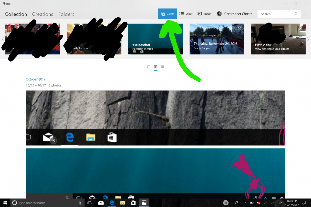
In any event, the Photos App has been revamped, and it’s a lot better than it was. A LOT better. At the top of the interface is a new tab, labeled “Create.”

Clicking on that gives you the option to make a “Video Remix,” a “Video project,” or an “Album.” A Video Remix, is essentially Microsoft’s way of saying “select a bunch of videos or photos, and we’ll put them together in a cool way for you. (The original demos of Video Remix had fire-breathing dragons, but I haven’t found them yet.) A video project is a more straight-forward method of making a small movie, where you have little more control of the process. It still needs a lot of improvement, but for those of us who have wanted a baked-in way of putting things together (that we had with Windows Live Movie Maker in Windows 7) this is a welcome addition.
A Boon to Productivity?
In all, though, and this is just the first day, I can’t point to anything in the Fall Creators Update that screams “this is going to make my job so much easier!” The extra polish is nice, but, to be honest, the best thing about the Creator Updates has been the InkSpace interface. And that came in the Spring. Nonetheless, I like that there have been improvements, and I’ll keep playing with things to see if anything really exciting pops out at me.

